Website, UX/UI Design
Shipment Management Dashboard


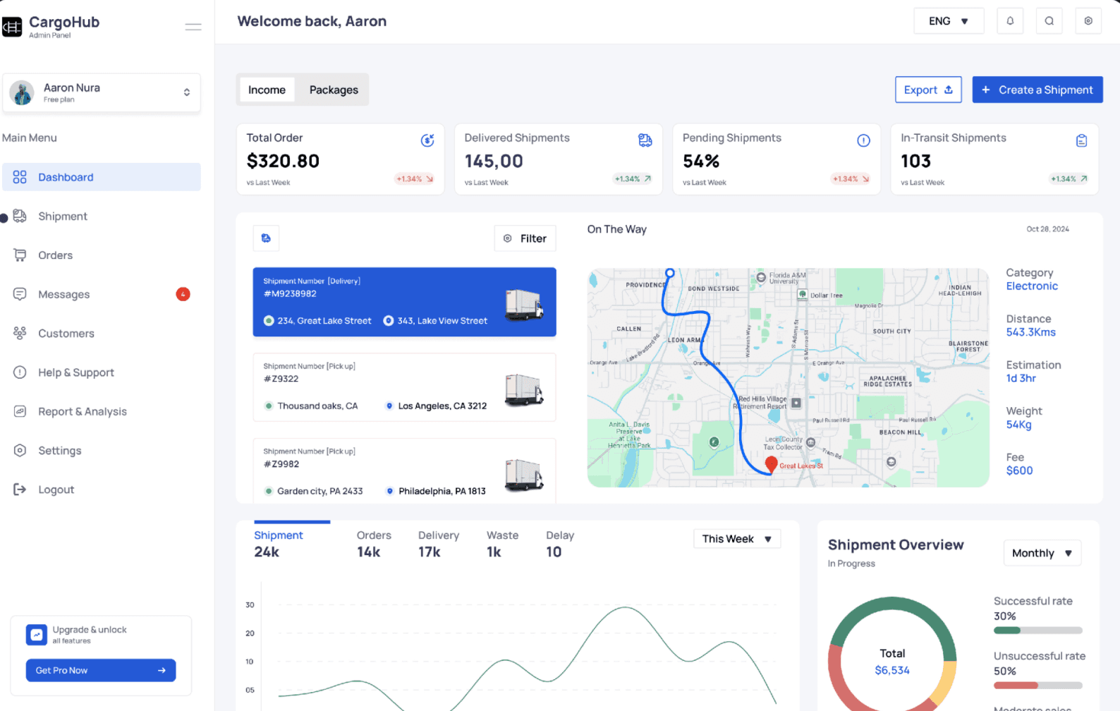


Crafted an intuitive easy-to-use dashboard page that gives users a quick view of their shipment activity at a glance.
With interactive charts and graphs, the dashboard provides valuable insights into shipment trends, order statuses,
and key performance metrics, helping users make informed decisions and act promptly.

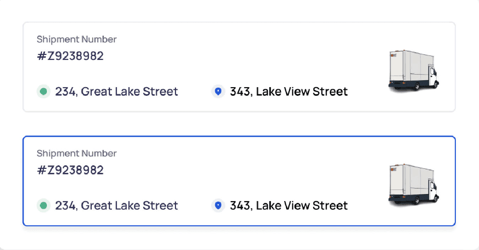
Developed a comprehensive all-in-one shipments page where users can manage all incoming and outgoing
shipments in one place. With easy-to-use filtering and search features, users can quickly find specific shipments
and view all the important details.
Overview
This case study covers the development of a shipment management dashboard designed to improve visibility, tracking, and operational efficiency for logistics teams. The project focused on building a user-friendly, data-rich interface where users could monitor real-time shipment statuses, track key metrics, receive critical alerts, and generate reports from a centralized platform. Tailored for complex logistics needs, the dashboard allowed users from different roles-operations, customer service, and management-to quickly access relevant data without information overload. By offering customizable views, clean visuals, and built-in analytics, the dashboard empowered teams to respond to delays in real-time and make data-driven decisions, ultimately improving delivery performance and workflow efficiency.
Product Goals
Display live updates on shipment location, status, and ETA to support quick decision-making.
Allow users to filter and search shipments by date, location, carrier, or status to quickly find specific data.
Display essential metrics (e.g., total shipments, on-time rate, and delays) for an overview of shipment
performance.
Provide data, trends, and insights (e.g., delivery success rate, average delivery times) to help users
analyze performance over time and optimize operations.
Organize the layout and navigation intuitively, making it easy for users to find and interpret information
efficiently.
Problem Statement
No Real-Time Tracking: Users cannot see live updates of shipments, making it hard to track progress and delays.
Data is Scattered: Shipment information is spread across different systems, making it time-consuming to find and use.
Hard to Use: Existing systems have confusing designs that slow down work and cause frustration.
No Predictions: Users don't have tools to foresee delays or issues, so they often react too late.
Not Flexible or Mobile-Friendly: Dashboards cannot be customized, and they don't work well on mobile devices for on-the-go users.
What I did
At this stage, I applied the Double Diamond approach, starting with exploring a wide
range of ideas to deeply understand the problem and user needs, and then
systematically refining and narrowing down these ideas into a well-thought-out,
effective solution for the user.
Why the Persona Method
I chose the persona method to better understand the target audience's needs,
goals and pain points. It helps design the dashboard to fit the needs of different
users, like drivers, managers, or customers. It makes sure the right information is
shown in a way that's easy to understand, improving how users work and make
decisions.
Key Components of This Project
Type
End to End Website
Role
Research & UX/UI
Timeline
Aug - Oct 2023
Customer Portal
Reports & Analytics
Order Management
Shipment Tracking
Customer Data Privacy
Dashboard
Shipment
Design Elements
Sub Components
Collapsible Sidebar
Icons
Color Palette
Typeface


0
Thank you for scrolling